Thursday, 6 January 2011

Analysis Of NME Contents Page


This is a contents page for NME magazine, It is a very busy page compared to my other magazine. It has all the basic information on it for example the page numbers, images and a brief summery of what you would find on that page. But then it has an added extra what they call a 'band index' this is where it shows all the bands that are featured inside and the pages that you can find them on.
The main image in the middle is of Kasabian who have a main featuring article in this issue. The image shows them in a relaxed environment with there instruments. This gives the reader an instant feel that this is an easy read magazine and that you don't have to worry about reading it in to much detail. The colours in the image have all been set up to sound the same colour scheme to show a calming effect.
They have made it easier for the reader by putting sub headings down the side so you can find exactly what part you want to read. Again giving the reader the sense that this magazine is easy and uncomplicated. There is also a red arrow down the bottom to indicate something that the reader would be interested in to then let the reader skip straight to page that they would be most interested.
There is a big bold advertisement down the bottom with the use of yellow writing so it is clearly seen by the reader. They would want people to subscribe to the magazine so they have a guaranteed circulation figure each week.
They have a bold title on the contents page that uses the words 'this week' this encourages us that its new information each week unlike some magazines that just repeat some of the stories as they don't have enough stories. Although some would say that this layout is a messy, it shows the reader that it is jam packed with information.

Contents page for The Company.


On this particular contents page and usually in the company high street magazine the content page is simple, the layout isn’t busy and full of information and pictures like other magazines. On this page there are four images and then the page numbers and a brief description about the page underneath.

The images are all taken from the inside of the magazine with the page number written on the picture as well so if you see the items of clothing in the photos then you can skip straight to the page and find out where and how much these particular clothes. They have chosen these images out of all the ones in the magazine as three of them out of four are in are from a photo shoot and are in a seductive pose, to entice the reader in as it gives the reader the idea that with these clothes you could look as good as the models. Then you have the odd one out, the photo that hasn’t been staged. Its of a regular girl to show that in this magazine on page number 74 there is a section where they find people that look good when they are shopping and asked to take there picture, showing that this magazine is down to earth and that you don’t need to be a top model or have lots of money to have these clothes.

The writing under the images where they give you the information, the font is a simple smart font, so its not complicated to read and the size is a small font as it looks classy. It makes you not just skip over the page, actually look carefully. The text the tile of the page is written in bold and italics this shows you clearly so you can find the article you want to read. Then next to that there is a brief very brief summary of what you can expect to read on that page. Often using language techniques like alliteration and repetition that would get you interested and sway you into reading it more.

The actual layout is smart and fashionable, its classy there is no mess it’s all there in black and white. It would appeal to its target reader as its stylish and gives you little hints about what’s inside without giving to much away.

Monday, 20 December 2010

A Day In The Life Of The Male Reader

The radio interrupts my deep sleep, at 6.00, i hit the snooze button. I turn my head to look at my second hand alarm clock, to find its 8.55 and I'm late for work. I through on a shirt and jeans and quickly eat a piece of toast. Then i slip on my big boots and grab my hat. I slam the door behind me. My boss is stressed as usual anyone would think he owns a top business company not blockbusters, hes rambling on about how I'm on my final warning i zone out as I'm working out which pub to hit on the way home.

I spend the day staring at clock as it feels like time is going backwards, i occasionally walk around so it looks like I'm contributing.. but really i have no idea what I'm doing. I look at this job as moving gradually forward to help the band and my beer fund eventually ill get a new job but for now this will do. The hand strikes 5.30 i pick up my beaten up old bag and pace through the door i heard a voice shouting behind me something about me forgetting to swipe my card so i can officially leave, he repeats himself every single day but yet i purposely 'forget' as i like the fact that i get under his skin so I'm not going to start to remember now.

The rain is hitting my head and dripping off nose, my feet splash in each puddle as i cant be bothered to walk around them, i go to look at my phone to check in with the band mates and its got no battery not that it would matter as i never have credit. I reach the pub, step inside and sweep my hands through my soaked scruffy hair and head to the bar. I grab a wooden stool and sit down like i have had a busy day when really, I've just done Check Spellingthe usual maybe even less. 'The usual' i mutter to the good looking bar maid even though there is still some tension from our last encounter. I gulp it down then head on back out in the rain to wonder back to the flat as we are rehearsing later.

i walk past the same little old magazine stall as the guy in there is a friend of my dads, so i go out of my way to make sure i buy it from him i pick up the same magazine every month to pick it up. its the ________ then later on me and the band will try out the months hottest acoustic song ourselves, some are better than others. After walking up several flights of stairs as the lift has been broken ever since i moved in i reach my front door. I slide my hand into my pocket to realise in the rush this morning i came out without my keys. Lucky really that my door is so busted with a bit of a shove I'm in. I kick off my muddy wet boots i kick back in my rather disgusting arm chair and wait for the others.

After a ear drum bursting rehearsal and a few complaints from the neighbours its back to being me and a bottle of beer. I spark up my evening fag and prop my feet up on the table to then enjoy an episode of inbetweeners and family guy. I wake up at stupid o'clock in the morning to find i had fallen asleep in the chair i stumble to the bathroom then to my uncomfortable bed ready to wake up for another action pack day.

Friday, 17 December 2010

Masthead Analysis


Analysis
The Fly magazine is very similar to the one i previously analysed as its again a strong masthead, with simple big bold letters, but the use of colour can change from issue to issue, as you see in these two examples. But they stick to the basic of the colours to keep clear, usually black or white. This magazine doesn't need extra frills, people want to read it anyway. When i am choosing what my masthead should look like i will definitely keep in mind that simple seems to be popular and effective. This magazine also uses capital letters this shows expression, that the content is something special something that should be read, that their has been energy and excitement behind the scenes to make it THE FLY.

Masthead Analysis


Analysis
The Company magazine have a simple but effective masthead its bold font and basic colouring gives of the classy feel that the magazine is trying to achieve. They have another technique which is repeated in every issue, an effect I'd like to use when it comes to designing my own masthead. Who ever is the model/models the company use as the main cover image they always have a part of the head or the arm overlapping the masthead. This gives the effect of layers which implies the magazine goes further into stories, not just touching the exterior but going into depth. Also making the main image stand out from the magazine. The title of the magazine is like statement, they are making a bold statement, not shy this encourages you to read the magazine.

The Moodboard Demonstrating My Ideal Reader


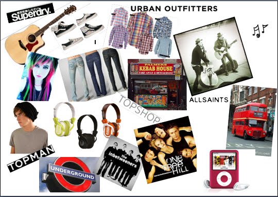
This mood board displays what the ideal reader of my magazine would like to watch, to listen too, and wear etc.
The brands of clothes i have put on this diagram demonstrate they would like to wear clothes that have a unique look to them but along with following the fashion. They wouldn't necessarily buy the highest priced items but they wouldn't buy the cheapest. The type of clothing she/he would buy are skinny jeans, checkered shirts, converse, plimsolls, big boots, and saggy hats, very much the casual look.
They would either have a beaten up old car barely fit to be on the road, or on the other hand only using public transport to get around for example the underground or buses. Constantly having headphones over their ears blocking the world out, if traveling on the train or eating their breakfast. Food, often grabbing things on the way, not sitting at a dinner table. Usually eating quick uncomplicated meals for example cheese on toast and scrambled egg. This is when he is at home to eat, often having to get dinner when out things like kebab's and fast food restaurants. When i say home, i would imagine the reader to live in a flat, undecorated, cluttered flat. With enough room with his friends to crash over but not spacious. The lock on the door would be broken needing a bit of nudge to get in, as soon as you get through the door you'd see empty bottles of Carling dotted around the flat. When getting over a hangover, he'd be lounged back on the sofa catching up on the episodes of his favourite shows that he would have missed during the week when at gigs or at the pub or busking on the street. Programmes like inbetweeners and misfits.

Friday, 3 December 2010

Analysing the second competitor magazine cover.


This is a front cover of an issue of The Company.


I chose the company as one of my competitors because i am linking fashion into my music magazine. It has the unusual fashion that the readers of my magazine would like. I like the way they have some high street brands so more affordable, but then also some of the more classy brands. I would link this into my magazine but would make the fashion i show more at the high street angle. As my ideal reader would be more interested in that then the really expensive clothes.

Price - This issue £2

First issue - 1978

Frenquency - Monthly

Current editor - Victoria White

Website - http://www.getlippy.com/


Magazine cover analysis :

Colours & Font size:

This front cover has a mixture of font colours yellow and pink. Colours that you wouldn't necessarily think would go well together, this tells the reader that this magazine has unusual clothes that not everyone wears, its individual but still looks good. The font size is different all over the front of the magazine, this makes the reader take a closer look to the front cover and time to read the text. This gives the magazine time to entice the reader into buying the magazine.

The tone:

The tone of this magazine is stylish and sophisticated but subtly cheeky. This means that they have all the fashion information you want and need to know, but has its on unique twist on it that reflects in the reader. I am going to use a similar tone in my magazine, but reversed. Mine is going to be mostly cheeky while subtly wanting to be sophisticated.

The content:

In this magazine they have the up and coming fashion, with celebrities, beauty, relationships and interviews.

The main image:

The main image on this cover is a woman in a fashionable but sexy dress. Showing us that she likes to be fashionable and follow the trends, but she also likes to look appealing to men. Her make up is done lightly but seductively with the smoky eyes look, she doesn't want to stand out too much but wants to be noticed. She is standing very casually angled towards the camera, inviting you into the magazine. I will pick up on some of these techniques and use them when staging my front cover.

The layout:

The layout on this front cover, is very scattered. This gets you interested in the magazine, as it clearly has a lot of information that you might not know. It keeps your eyes busy so they don't get bored and look over the magazine and move to another. This is a clever technique that makes this particular magazine stand out from other magazines.